Welcome to Tag Along Lovely!
Maybe your names seem too difficult and you need some new ideas.
Or you have a few ideas already but were hoping for something just perfect.
Or maybe you’ve tried everything and you’re at your wits’ end and ready to give up and wish someone would just find something for you…
You’re in the right place!
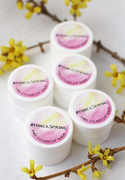
We love helping brides (and their favorite people) dream up fun and unique wedding hashtags. We started by creating tags for the bachelorette party and bridal shower favors we made at The Favor Stylist. Then we wrote a series of blog posts and free worksheets. We added so many that they needed their own site. So here we are!
All of our hashtag posts, workbooks, and worksheets are here and available to read and download. And if you need more help and ideas, you’re welcome to join us at our Facebook group, where 3,000+ amazing Lovelies help each other find the perfect wedding hashtag.
Ready to start? We’re so glad you’re here!